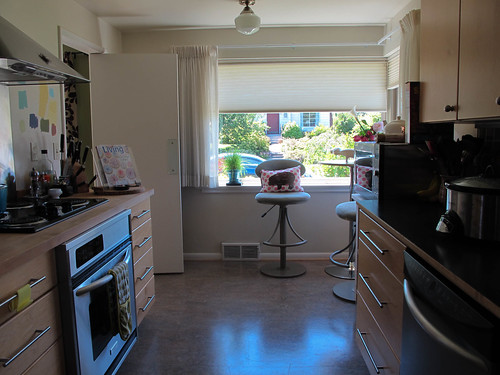
Our kitchen needs a fresh coat of paint and I figure if we are going to paint it, I'd like to add a bit of color. My problem is that I can not decide on a color at all.
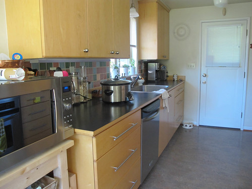
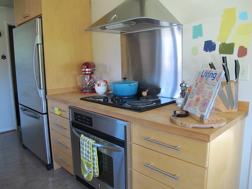
At first my husband suggested yellow but after putting a few samples on the wall, we noticed that they matched the cabinets (light maple) way too closely and that we needed some contrast.
Then we thought, Green! But the dining room which is adjacent is a light green and really that feels like a lot of green.
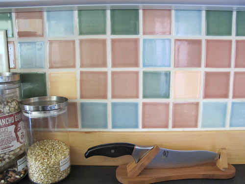
We also have this beautiful tile back splash that we'd like to coordinate the paint colors with.
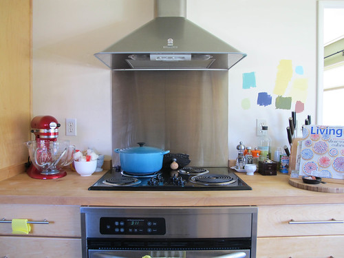
Finally I just took all my Martha Stewart Paint Samples out and we painted swatches on the wall that we plan to paint. The rest of the walls will remain a nice cream.
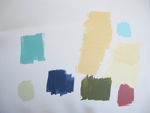
So tell me, which color would you paint my kitchen? I'm not married to any of these particular colors but I need direction and lots of help!

So, I understand that blue in a kitchen is not an "appetizing" color, although I do love aqua. I have a color in my living area that's called desert tan (but looks gold-yellow). That would match one of your tiles. I love the color, although you would need to see if it provides enough contrast with your cabinets. Definitely spend the money on paint samples! Colors always look different due to lighting of course. You could do a lighter shade of green then you have in the adjacent room, sometimes it's nice to have a color theme depending on the size of your home.
ReplyDeletea really light shade of mocha? is one of the tiles mocha? hard to know if the computer screen is showing your true colors
ReplyDeleteHello Supergirl! I'd take the blue or green tiles to the paint store, and have them mix paint that is exactly the same. Then I'd lighten it up with, say 50% white and test that. You want the walls to be a color that is already there. Also make sure to have a common element with the adjoining rooms - if you have white ceiling or trim, I'd keep that the same.
ReplyDeleteI really love the top left blue. I think it would give such a nice pop to the room, match the backsplash, and your le cruset pan. :)
ReplyDeletei'd probably say the blue in the upper right hand corner... it looks nice and bright and fun, and will also match the tiles. win-win.
ReplyDeleteI like one of the 2 liter blues. Pretty! :)
ReplyDeleteThe blue in the upper left!
ReplyDeleteThanks everyone! We're leaning toward aqua now. Now to find the right shade of aqua.
ReplyDeleteThey're all nice colors. I love the top left color best. :)
ReplyDeleteThis comment has been removed by the author.
ReplyDeleteActually, the aqua seems like it would be really nice.
ReplyDeletei really like the green on the bottom left. I am planning to paint my living room soon. Do you happen to know the name of that color?
ReplyDeleteThanks much!
k - I can't remember what the color is called. Maybe Kelly Green? All the samples were from the Martha Stewart Paint Line so maybe that will help? I know Home Depot sells her paint.
ReplyDelete